Zone Hero Image

Partnership Overview

Redesigning SAP for Me's Partnership Overview tab to consolidate the data SAP Parnters need — reducing unnecessary navigation to sub-pages and surfacing time-sensitive compliance deadlines before they were missed.

OVERVIEW

Role
Lead Product Designer
Team
Senior UX Designer, Product Leader, Product Manager, Developer
Contributions
My contribution to this project included facilitating user research and testing, iterating through wireframes, presenting in design reviews, and producing polished high-fidelity mockups.

Context

SAP for Me

SAP for Me is a centralized hub for SAP's global network of customers and partners. I owned the partner-facing experience, designing touchpoints that help partners stay on top of what's needed to maintain their standing as an SAP partner.

Problem

A page partners had learned to ignore

Partners had developed a habit of skipping the Partnership Overview tab, navigating directly to sub-pages for the information it should have been surfacing. Those less familiar with the platform had an even harder time, as critical metrics and compliance data were scattered with no clear starting point.
Key Takeaways from the Brief

Previous Partnership Overview tab. Consists of four visually identical alert cards dominating above the fold, leaving minimal room for actual partnership data.

Research

Understanding the Users

The team had strong instincts on what to prioritize, but I pushed to validate those assumptions with real partners before committing to a design direction.

I conducted moderated usability testing sessions over Zoom, accompanied by the PM, with global enterprise partners across different regions and partnership tiers. Partners walked us through their day-to-day use of the platform before seeing anything new. This surfaced which pages they actually defaulted to, what data mattered most, and where real workflow friction existed. I extracted the following insights.
01. Scattered Data
Partners weren't looking for complex data. What they needed was already available across the platform, just never consolidated.
02. Deadlines lacked specificity
Time-sensitive compliance information wasn't communicated with enough precision to act on. Vague language left partners unsure of how much time they actually had.
03. Alerts without hierarchy
Not all alerts were equal, but the design treated them that way, making it hard to know what actually needed attention.

Design Decisions

Final Design

Entering the Overview tab, Partners are presented with 9 unique informational cards for quick access to relevant data while maintaining visibility and access to important alerts, action items, and additional resources.
Key Takeaways from the Brief

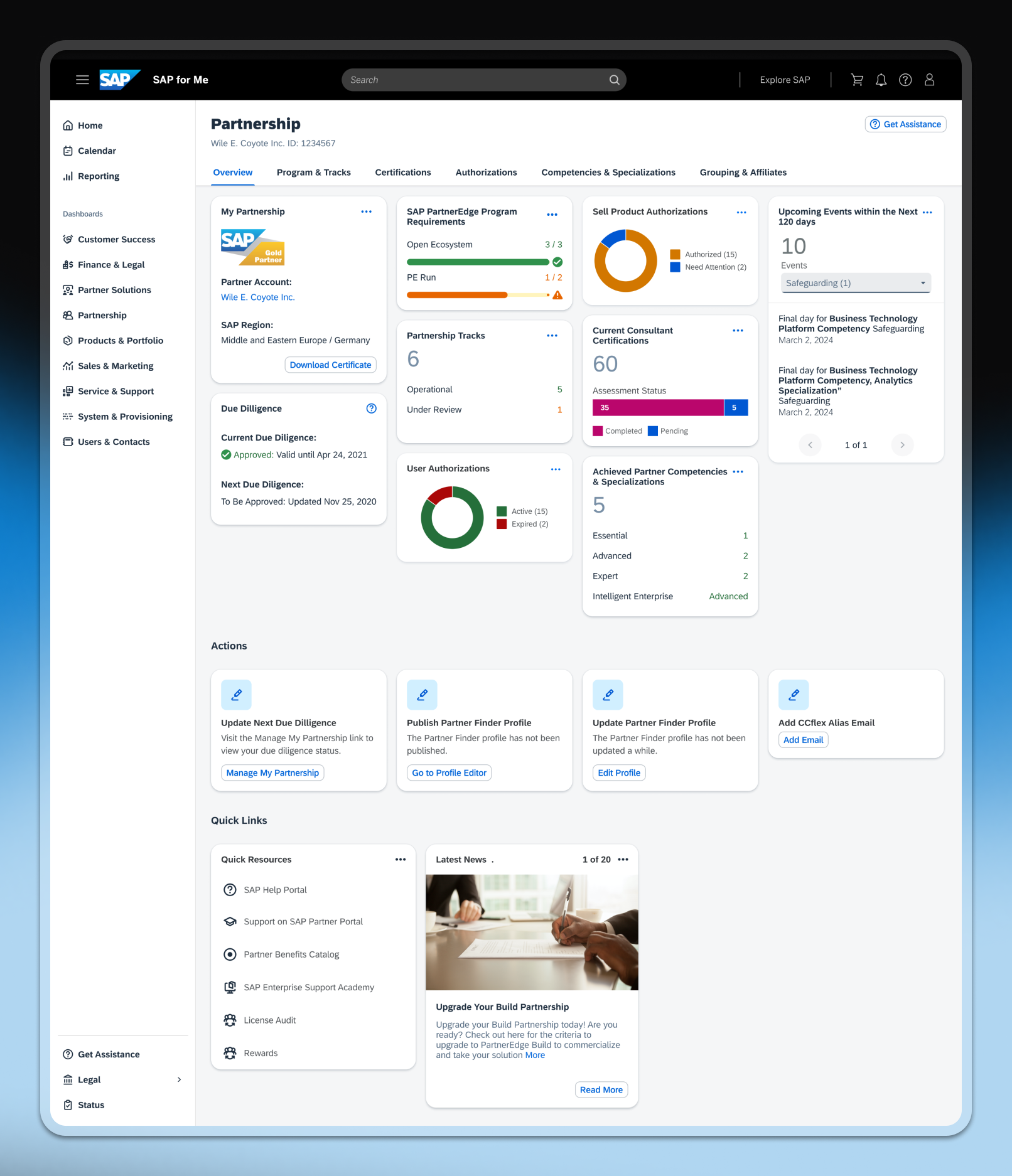
Full view of the overhauled Overview tab.

Informative, but also navigational

Each top-level card was designed to correspond directly to a sub-page, so clicking a card navigated the partner to the relevant deeper view. This created a consistent mental model. The overview wasn't just informational but rather a navigation layer that reduced clicks for the most common daily tasks.
Key Takeaways from the Brief

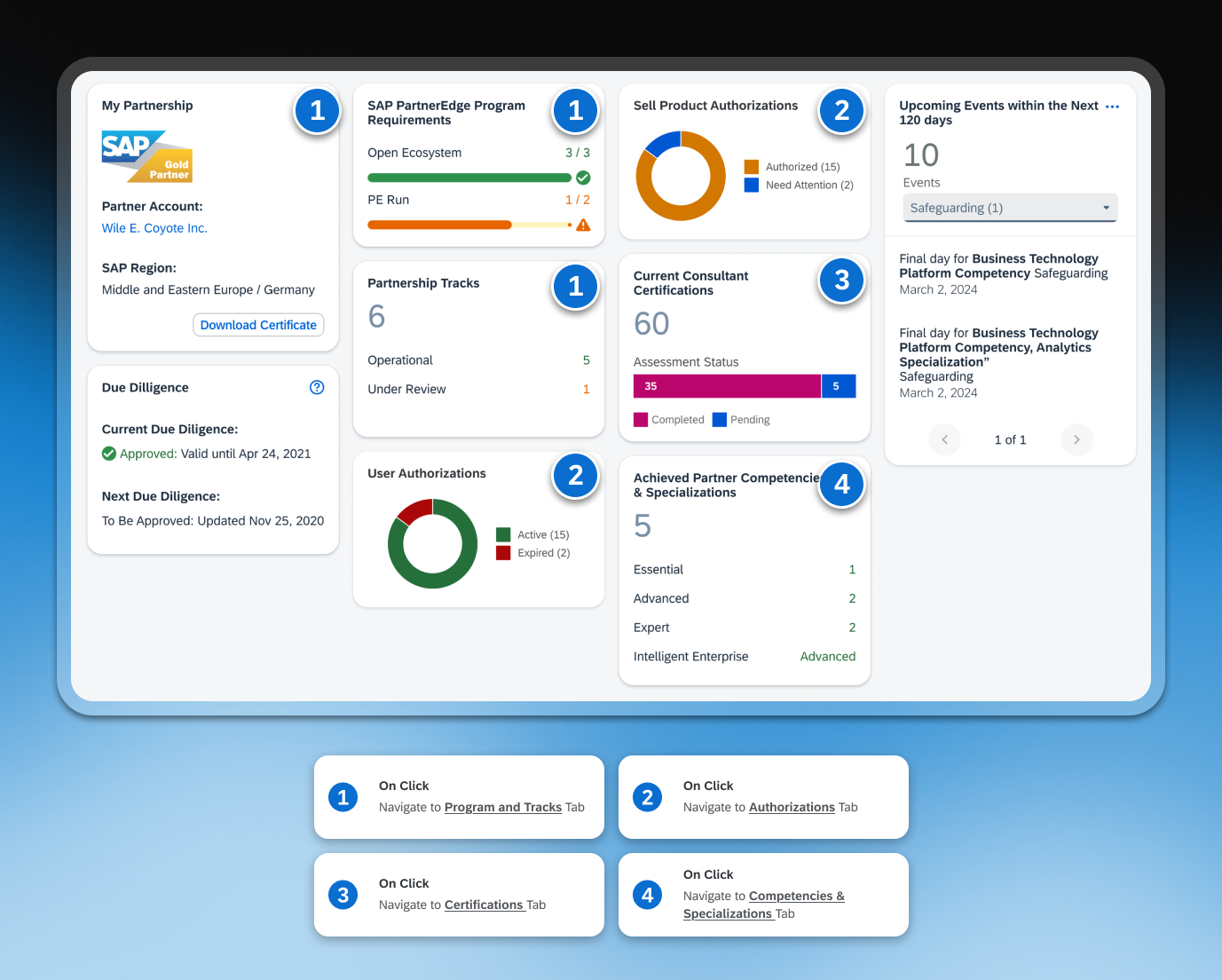
Annotated handoff showcasing the expected tab to navigate users to when clicking on the cards.

Time-bounded events view

A 120-day window ensured partners saw upcoming events with enough time to act, without being overwhelmed by distant deadlines. Dropdowns allowed partners to filter by alert type, while pagination kept cards scannable regardless of how many events were active.
Key Takeaways from the Brief

Examples of alerts that could exist within this card.

Actions and resources at a glance

A 120-day window ensured partners saw upcoming events with enough time to act, without being overwhelmed by distant deadlines. Dropdowns allowed partners to filter by alert type, while pagination kept cards scannable regardless of how many events were active.
Key Takeaways from the Brief

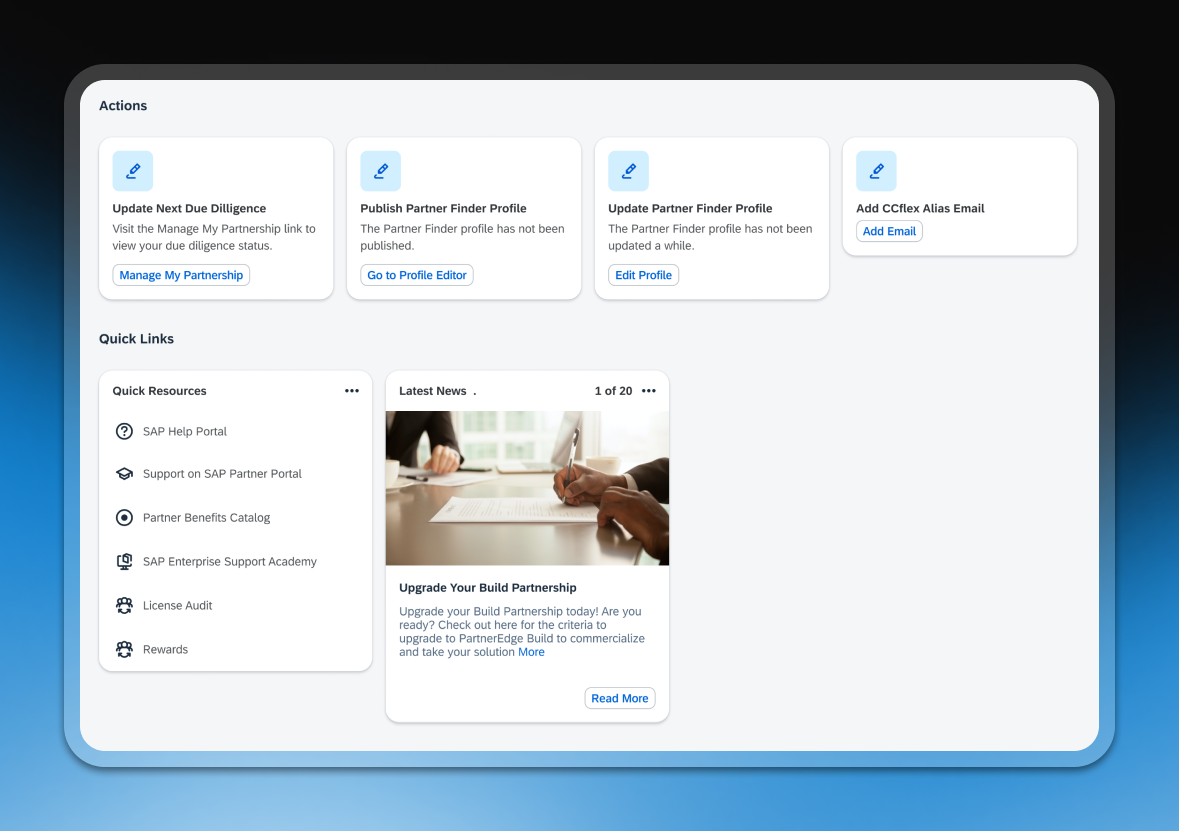
The Actions and Quick Links sections ensured the overview served as a complete starting point for managing a partnership.

Impact

01. User Satisfaction
A post-release user survey showed early increases in both usage and satisfaction with the Partnership Overview tab, contributing to a 7% increase in the desktop platform's satisfaction rate. This validated that partners weren't ignoring the page because it was unwanted, but because it hadn't been earning their attention.
02. Consolidating Data Points
The redesign consolidated 8–10 data points and alerts that had previously been spread across 5 separate sub-dashboards onto a single overview page — quantifying exactly how much friction had been removed from partners' daily workflows.

Final Thoughts

Next Steps

The launch was scoped as a phase one, prioritising a functional and engaging baseline over solving everything upfront. Next steps included exploring dashboard customizability, giving partners the ability to tailor the overview to their role, partnership tier, and priorities.The team had strong instincts on what to prioritize, but I pushed to validate those assumptions with real partners before committing to a design direction.
Key Takeaways from the Brief

Recognition from the team.

More Projects